Apparently, this time and day board games are the hotness. They seem to be so big „a thing“, they can now easily be used to promote huge international brands and keep them rolling nicely. Sometimes quite literally.
I needed a new set of summer tyres for my car. While I made myself comfortable on a Ferrari red sofa with a nice cup of coffee for the wait, I casually glanced across to the “kid’s corner“. I had expected to see toy cars and wooden building bricks, picture books and the like. They were all there, of course, and even that inescapable dexterity “game“ where the child entertainee has to navigate some (theft-and-nonsense-proof) ring or other device along twisting wires and all kinds of challenges towards some goal within the construction. I find these contraptions ever so enticing and am very temped to give it a go, but when all is said I always end up not to because squatting down on one of those miniature chairs with my ears next to my knees would be too embarrassing…
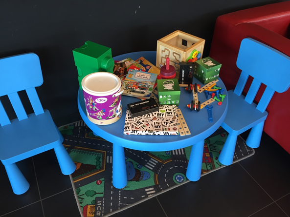
But the dexterity game was clearly outshone this time buy a total of three boxes with different games all produced for promotional purposes. There was a “family game for up to 7 players“ titled “I love my Doblo“ designed after “Snakes and Ladders” meets “Game of Life“, having event spaces like “Mom is sick. Move back 5 spaces.“, “First soccer training. TraTransporting half the team. Advance 7 spaces.“ und “Puberty. 3 spackes backwards. Have an argument.“ (NOT joking here.)
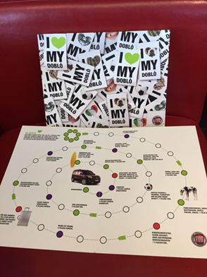
The winner is whoever gets on the new Fiat Doblo in the centre of the board first. If you can also ”beat“ the other player’s pieces and send them back to “start“ like in other games was not explicit in the rules. I have an idea that if you would like that, a little “house ruling“ would be in order. Sadly, playing pieces and dice were missing. (Which proves the point regarding the self-defending precautions with any mobile components of the dexterity game.)
It is not just theme as such which is promoting the brand here, there are also promotional statements inserted in the details. You are informed there is a navigation system on board, or you stop on an event like “Summer vacation. Taking the surf board along. Plenty of room. Advance 1 space“, pointing out the advantages of the particular vehicle that is meant to be made desirable to you . To be fair, there are actually just 5 (or maybe 6 if you want to be a little more nit-picky) in a total of 19 event spaces that have any reference to a car and its uses, and not every one of them is positive Positives; there is one that tells you the car boot is too large and loading up therefore takes forever, so you have to skip a turn. (That is, of course, a fairly see-through tactics, but I would still say it is “pretty clever“ – if that was not also some form of promoting a saleable item.) The other events cover a wide range of landmarks in a young person’s life like taking your very first steps, chickenpox, good marks at school, the very first kiss and love sickness. You are, however, left with the impression that as soon as you reach adulthood – and according to the editors of the game – purchasing a nice large famlily cars should be high on your list of priorities. This adds a whole new dimension to the “family friendly“ attribute of a board game.
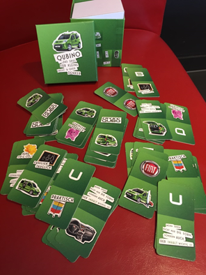
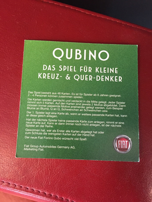
The card based game “Qubino“, a game “For young unconventional and lateral thinkers“. Basically following the rules of “Domino“ while playing, the future customers are training themselves to acknowledge all those reasons for buying the product that are being suggested to them from the sales catalogue, at the same time bonding to the company’s logo.
Some form of unconventional thinking may be happening to transfer the rules of “Domino“ onto “Qubino“, but there is no way the game teaches any independent lateral thinking to the young gamers. On the contrary, this happens the less the more the game actually achieves to be fun.
The two copies of a memory game were also next to complete. I simply had to get down to sorting the cards into their boxes! One of the games appeared complete by all standards, the other one was lacking two cards, but this would not have impaired the playability in a significant way if all you wanted was to pass some time while u wait. All it would take was to remove those cards that were lacking a double from the game. I am not going to lie to you: That design was ever so cool! So cool, I was seriously tempted to buy a copy if at all possible. (I even asked but was told the game was not available for purchse. Why was that, I wondered. Such a pity.)
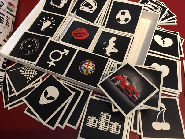
The slightly abstracted images in black white and red colours all shared the same theme; in a wider sense they all depicted automobiles, racing and lots of things related (will not start contemplating the broken hearts and lipstick prints, though). There were only two motifs showing the photographic images of the company logo and actual car models. It definitely had something there…
Good play – better day!
